Typography
1. Overview & Downloads
We’ve aligned on one brand typeface, from marketing to product, so we can maintain a clear and consistent digital experience across all major customer touchpoints. This is driven by the typeface Roboto.

Primary font
Roboto
Roboto is used by designers and developers who create all of our brand expressions from web components to email banners.

Secondary font
Segoe UI
Segoe UI is used in all Microsoft Office applications: Outlook, PowerPoint, Word, Excel, and more.
2. Roboto
Learn more about how to use Roboto:

Roboto
Weight
Roboto Light
Roboto Regular
Roboto Medium
Roboto Bold

Roboto
Color
Core Dark (#333333) is the default text color. We choose type color carefully and always keep legibility and accessibility in consideration.

Roboto
Scale
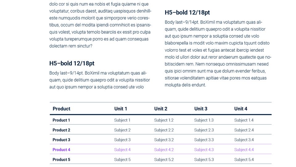
We use the “Major third” scale to provide a wide range of sizes to support all expressions of our brand.
3. Typography Non English languages
We use Roboto for all Latin, Greek and Cyrillic scripts.
For all other languages not supported by Roboto, we use Noto typeface family. Noto is a collection of high-quality fonts with multiple weights and widths, supporting global communication in more than 1,000 languages and over 150 writing systems. Please reference the chart below:
| Language | Typeface |
| Japanese | Noto Sans Japanese |
| Korean | Noto Sans Korean |
| Chinese | Noto Sans Chinese |
| Arábia Saudita | Noto Sans Arabic |
| Israel | Noto Sans Hebrew |
4. Type in Action
How we effectively use Roboto within our brand expressions: