


Central da Marca
Seu ponto de parada para tudo relacionado a marcas.
Bem-vindo ao Centro da Marca Software AG
Criamos este espaço para todos aqueles que trabalham com os pontos de contato da Software AG, sejam eles quais forem, com o objetivo de criar experiências de marca mais consistentes e impactantes. Encontre respostas para todas as suas dúvidas sobre como e quando você pode utilizar nossos elementos de marca.
Nossos elementos de marca

Logotipo
O logotipo da Software AG é a pedra angular da nossa identidade. Nossa marca é composta por um símbolo e um logotipo tipográfico. Ela não substitui nem ignora nosso legado de 50 anos como empresa. Suavizamos alguns traços e acentuamos outros para nos adaptarmos ao mundo digital em que vivemos.
Tipografia
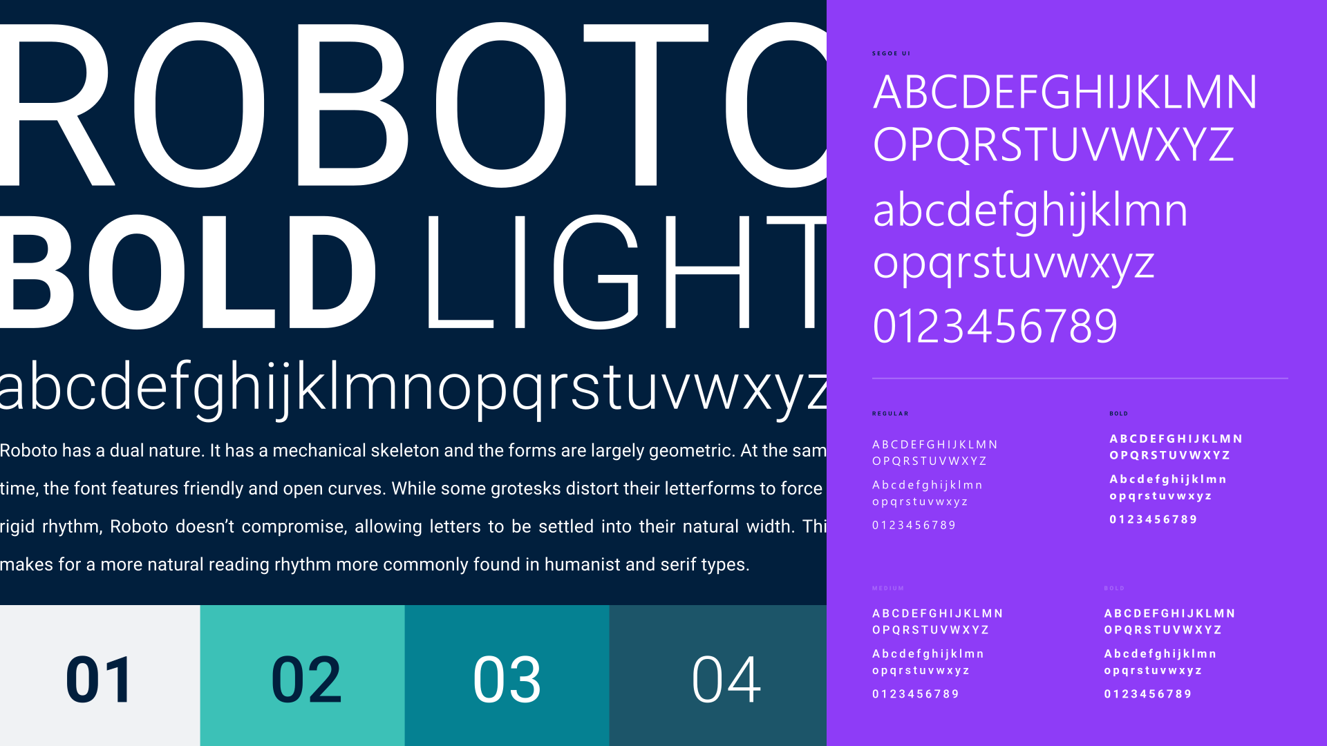
A Software AG possui um novo sistema tipográfico atualizado — adotamos uma única fonte para a marca, do marketing ao produto, a fim de manter uma experiência digital clara e consistente em todos os principais pontos de contato com o cliente. A fonte Roboto é o elemento central dessa estratégia — e é assim que a utilizamos de forma eficaz nas expressões da nossa marca.

Cor
Nossa paleta de cores prospera na combinação de nossas duas cores primárias principais, Pulse (roxo) e Sense (verde). Usar essas cores em conjunto com nossas cores secundárias e terciárias demonstra nossa marca de maneiras altamente expressivas. Gostamos de pensar que é elegantemente ousado. Conheça nossos casos de uso, valores de cor e porcentagens, bem como combinações de cores.
Fotografia
In our photography, we represent two distinct, but harmonious, approaches: “structure” and “flow.”

Iconografia
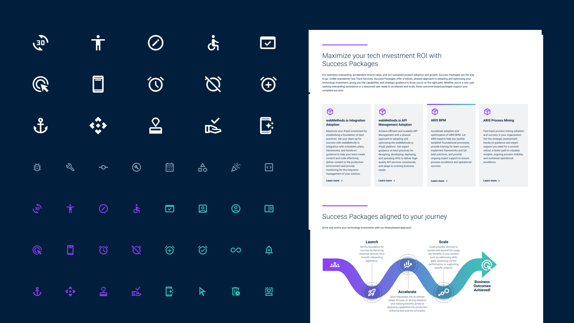
Nossos ícones são icônicos. Nossa iconografia pode ser usada para contar histórias e fornecer funcionalidades em espaços digitais. Eles podem ser usados em uma versão de 1 cor ou de 2 cores quando os ícones servem como elementos gráficos principais.
Voz da Marca
Explore a direção geral de como falamos como marca, que se alinha com a narrativa em torno da "Simplicidade". Conheça nossos princípios orientadores simples e dicas claras para ser consistente em todos os canais e entregas.