Brand Center
Your one-stop shop for everything brand related.
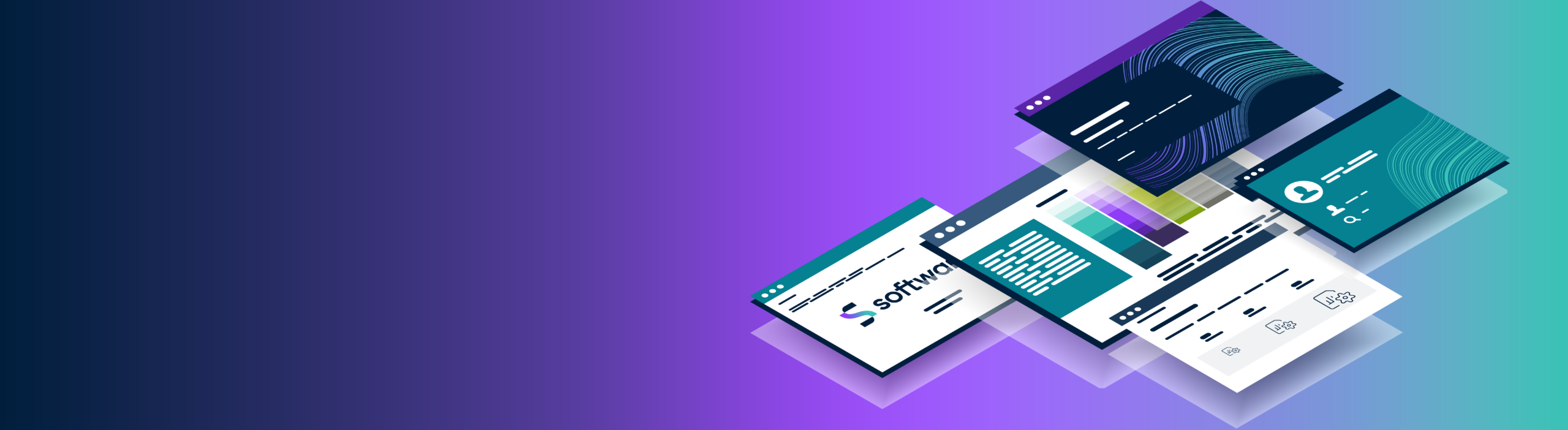
Welcome to the Software AG Brand Center
We’ve created this space for everyone working on Software AG touchpoints of all kinds with the goal to create more consistent and stronger brand experiences. Get answers to all your questions on how and when you can use our brand elements.
Our brand elements
Brandmark
The Software AG logo is the cornerstone of our identity. Our brandmark is made up of a symbol and wordmark. It doesn’t replace or ignore our 50-year legacy as a company. We’ve smoothed some edges and sharpened others for the design to fit in the digital world we live in.
Typography
Software AG has a new, updated type system—we’ve aligned on one brand typeface, from marketing to product, so we can maintain a clear and consistent digital experience across all major customer touchpoints. This is driven by the typeface Roboto—this is how we effectively use Roboto within our brand expressions.


Color
Our color palette thrives on the combination of our two main primary colors, Pulse (purple) and Sense (green). Using these colors together with our secondary and tertiary colors showcases our brand in highly expressive ways. We like to think it’s elegantly edgy. Get to know our use cases, color values and percentages as well as color combinations.
Photography
In our photography we represent two distinct, but harmonious, approaches: “structure” and “flow.”


Iconography
Our icons are iconic. Our iconography can be used to tell stories and provide functionality in digital spaces. They can be used in a 1-color version or in a 2-color version when icons are used as hero graphics.
Brand Voice
Explore the overall direction on how we speak as a brand, which aligns to the narrative around “Simplicity”. Get to know our guiding principles, which are simple, clear tips to be consistent across channels and deliverables.
